
I know, you’d much rather read about a favorite recipe than see boring investment charts. Tracking my Facebook shares and newsletter clicks bear this theory out. But, every once in a while, to get to the dessert, you must eat your vegetables. Consider today’s blog a vegetable.
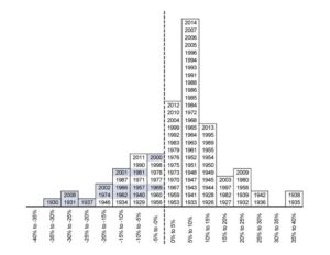
I don’t remember where I got this, and I can’t find a newer one that 2014, but I still love it. This chart provides a quick visual as to how often the stock market loses money versus how often it gains. More importantly, it shows how much bigger the gains typically are than the losses.
Is the stock market the place to safely store all of your money? No! Certain pools of money should stay far away from stocks. But, for long-term growth (say, retirement or college funds), buying diversified stock funds (and HOLDING them through recessions) is how your money will work for you to reach those financial milestones.
See, that wasn’t so bad!